To have success with marketing, you must deliver the right information, to the right person, at the right time. Although it is challenging, it is the reason why landing pages are so crucial.
When you direct your visitors to a specific page with a form to download a promotion you are offering, not only are you pleasing your visitor, but you’re also setting up the foundation for a great marketing campaign. In fact, landing pages are effective for 94% of B2B and B2C companies1.
The average attention span online is about eight seconds, so it’s critical you optimize your landing pages for instant conversion. Follow these best practices below to set yourself up with a landing page that converts.

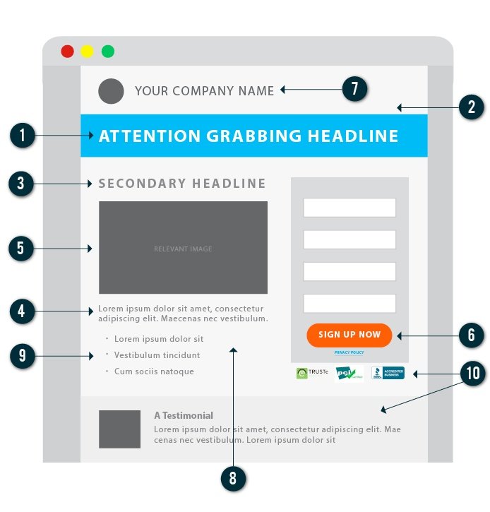
- Create an attention grabbing headline: This is the first element your visitor will likely see, so use this opportunity to sum up your offer as clearly as possible.
- Remove navigation: A visitor landed on your page to receive an offer that you promoted. Don’t distract them from this offer by trying to send them to another page on your site, keep the navigation off of your landing page. You can add it back on your follow up thank you page.
- Get straight to the offer: It isn’t uncommon knowledge that we all have short attention spans and even shorter amount of time to spend on a landing page. Make sure you get straight to the point. Remember, your visitors came to this page for a specific purpose so clearly outline what it is they are expecting and how it will address their needs, interests, or problems.
- Value of the offer: The hard part is done, you got them to your page but now you have to convince them to fill out the form and convert. Do this by clearly laying out the value of your offer. Include things like what they will learn or take away from this offer. Use bullet points to break up large blocks of text and keep your copy brief so the value is easy to read and understand.
- Use relevant images: 90% of information transmitted to the brain is visual, and visuals are processed 60,000X faster in the brain than text.2 This alone should be convincing enough to include an image relevant to your offer.
- Contrasting CTA: It’s always important for your CTA to stand out. To ensure your visitor completes the goal of filling out the form and clicking the submit button, make sure that button pops off the page in a contrasting color.
- Keep branding on top of your mind: Sometimes a visitor might not know the company that is promoting the offer when they click through to your landing page, especially if they came from non-branded sources, like social media and search. To confirm users know your brand, add your logo to the top of the landing page. It doesn’t need to take away from the offer but it should be clear that this offer is coming from your company.
- Avoid clutter: Keep it clean and simple. Stick to 3 colors, one consistent font, and one relevant image. A/B tests at HubSpot have repeatedly shown that including too many over-the-top images don’t actually help conversions. Any images you use should support, not distract, the route to conversion.
- Formatting is key: Formatting is one of those low hanging fruits that can really change the look of your landing page with minimal work. By utilizing clear headers, easy-to-scan bullets, and emphasizing important points with bolded text or italics, you can really set the stage for easy conversions. Since 1 in 3 of landing pages are viewed on tablet or smart phone3, make sure that your landing page is responsive and the formatting is clean and clear!
- Include trust factors: An eTrust, PCI or BBB badge on your page will ease any fears or concerns that your visitors may have. Also throw in a privacy policy link. Testimonials can also be great trust factors.
These best practices will set you up with a solid landing page template, but it’s up to you to think outside the box and test different elements that are tailored to your unique audience. A/B testing of landing pages can generate up to 30-40% more leads for B2B sites and 20-25% more leads for eCommerce site. So create your landing page and get testing!
Sources
- MarketingSherpa
- Web Marketing Group
- Monetate Ecommerce Quarterly EQ4 2013 report